First, we were tasked to download examples of image types.
Below are the images I downloaded for each image type. At the left side of each image is the corresponding information of the image obtained using <imfinfo>.
Image Types:
1. Binary image
 | ||
| Figure 1. An example of binary image |
Filename: /home/venven/Desktop/ap186/batmanBW.jpg
Filesize: 8072
Width: 225
Height: 225
BitDepth: 8
ColorType:grayscale
2. Grayscale images
 |
| Figure 2. An example of a grayscale image |
Filename: home/venven/Desktop/ap186/gaussianG.jpg
Filesize: 11349
Width: 500
Height: 500
BitDepth: 8
ColorType: grayscale
3. Truecolor images
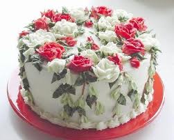 |
| Figure 3. An example of truecolor image www.whatscookingamerica.net |
Filename: home/venven/Desktop/ap186/cake1.jpeg
Filesize: 10594
Width: 251
Height: 201
BitDepth: 8
ColorType: truecolor
4. Indexed Images
 |
| Figure 4. An example of indexed image http://printplanet.com/forums/enfocus/16504 -indexed-color-spaces |
Filename:/home/venven/Desktop/ap186/Indexed.jpg
Filesize: 12246
Width: 288
Height: 288
BitDepth: 8
ColorType: truecolor
5. High dynamic range images
 |
| Figure 5. An example of high dynamic range image http://www.cambridgeincolour.com/tutorials/high -dynamic-range.htm |
Filename: /home/venven/Desktop/ap186/hrd.jpg
Filesize: 27848
Width: 300
Height: 200
BitDepth: 8
ColorType: truecolor
6.Multi or hyperspectral image
 |
| Figure 6. An example of hyperspectral image http://exosky.net/exosky/?p=880 |
Filename: /home/venven/Desktop/ap186/orion.jpg
Filesize: 1189338
Width: 1600
Height: 1600
BitDepth: 8
ColorType: truecolor
7. 3D images
 |
| Figure 7. An example of 3D image http://www.aeromental.net/2011/01/11/5000- photos-for-3d-glasses-red-and-blue-cyan/ |
Filename: /home/venven/Desktop/ap186/3D.jpeg
Filesize: 246364
Width: 500
Height: 378
BitDepth: 8
ColorType: truecolor
--------------------------------------------------------------------------------------------------------------------
The next task was to explain image file formats.
1. Lossy image compression
When compressed, some information from the image is not contained in the file.
Examples of lossy image compression:
a. GIF
This stands for Graphics Interchange Format. It is a compressed file format and is limited only for 256 colors. As a consequence, it is usually used only for animated images, icons, and logos [1].
b. JPG or JPEG
This file format is named after the committee that created it. It stands for Joint Photographics Experts Group. Compared to GIF, JPEG has a wider range of colors. Thus, it is more used for colorful images and high resolution images [1]. This makes it mostly used by many people.
2. Lossless image compression
When compressing an image, each pixel is maintained.
Examples of lossless image compression:
a. TIFF
This stands for Tagged Image File Format. It ranges from 1-bit to 24-bit. It is mostly used for important images since it contains all the information of the original image.
b. PNG
Another image format is PNG which means Portable Network Graphics. It is mostly used by graphic artists and web developers.
---------------------------------------------------------------------------------------------------------------
Finally, we were told to follow the procedure given in the activity sheet.
The scanned image in Activity 1 was opened in Scilab and its size was observed. The code and the output is shown in Figure 8.
 |
| Figure 8. Code in obtaining the size of scanned image and the output |
We were also made to gather examples of image types. It was shown at the first part of this blog. At the right side of the images, the image properties were shown. The properties was obtained by using the code below:
info = imfinfo('/home/venven/Desktop/ap186/batman.jpg');
From the collection of images previously, I took one of the images and converted it to grayscale. The code and the output is shown in Figure 9.
 |
| Figure 9. Convertion of an image to grayscale |
It was then converted into black and white using 0.5 as the threshold value. Figure 10 shows the code and the output.
 |
| Figure 10. Conversion to binary image |
In figure 10, it can also be noted that the matrix size is the same with the previous one.
Same step was done to the scanned image in Activity 1. Figure 11 shows the conversion of scanned image to grayscale.
 |
| Figure 11. Convertion of scanned plot to grayscale |
To get a good approximation of the threshold value, the histogram of the grayscale image was obtained. The code used for obtaining this is shown:

 |
| Figure 12. Code and output of the histogram |
The imhist function showed values from 0 to 256. After zooming in, the approximated lowest value was at 113. To get the threshold value, I divided this to 256. Thus, the obtained binary image is shown in Figure 13.
 |
| Figure 13. Binary image of the scanned graph |
Now, the background noise can then be eliminated since it was converted to a binary image. A binary image is an image containing only black and white. As a result, only the lines in the plot can be seen.
Self-evaluation:
For this activity, I rate myself a 10 out of 10. 5 for technical correctness since I indeed understood all the concepts and 5 for quality of presentation since I was able to show all the figures and texts in a very understandable manner.
It was fun searching for examples of different image types. Also, I was able to discover the differences in file formats in images.
-------------------------------------------------------------------------------------------------------------------
References
[1]http://www.techterms.com/


